Flowtrail AI Reports
After creating the datasets, you can leverage Flowtrail AI to generate detailed and customized reports that transform raw data into meaningful insights. The powerful reporting capabilities of Flowtrail AI allows you to visualize your data in a variety of formats, making it easier to understand trends, patterns, and key metrics.By following a straightforward process, you can create reports that are not only informative but also visually appealing, catering to the specific needs of your business or research objectives.Follow these steps to generate insightful and impactful reports using Flowtrail AI, maximizing the value of your datasets and enhancing your data-driven decision-making.
Creating Reports
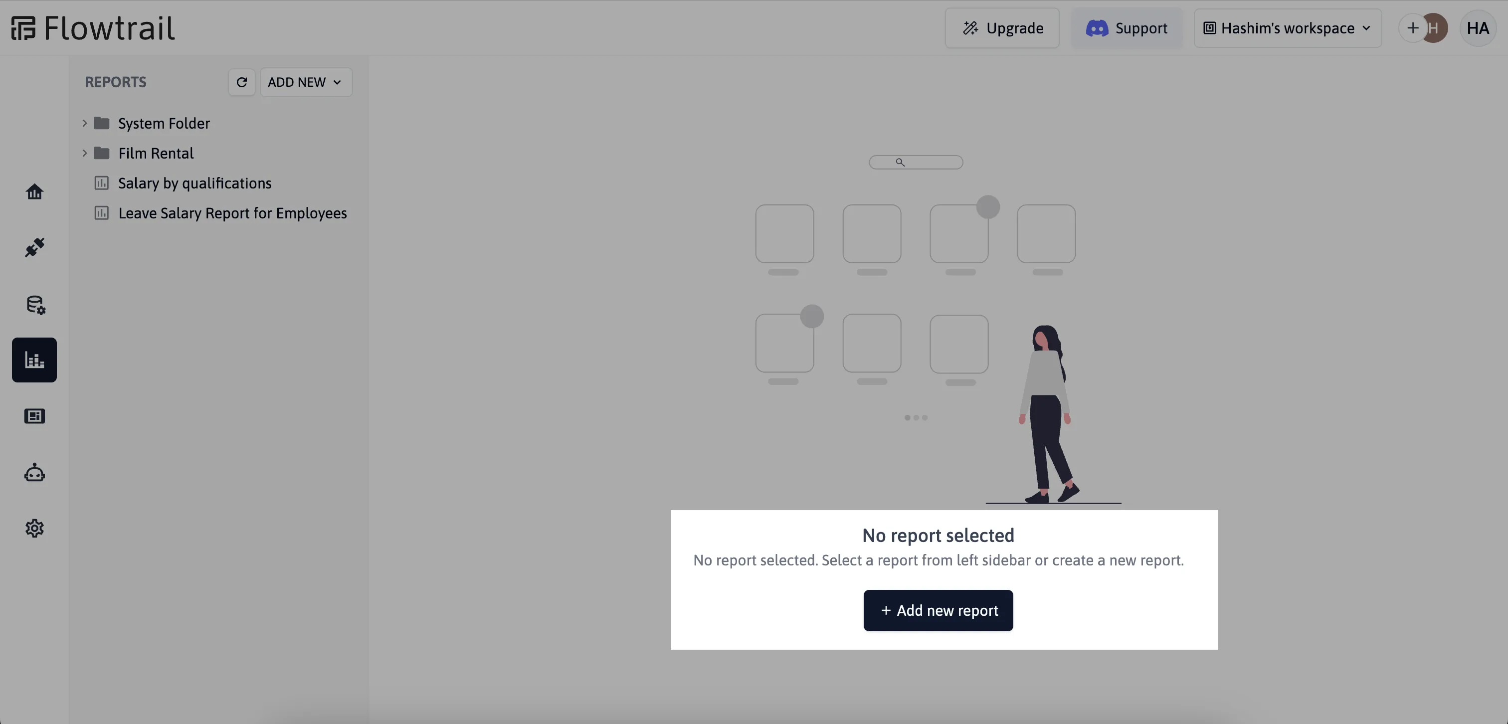
Navigate to Reports page in Flowtrail AI and click on the Add new report button to get started.
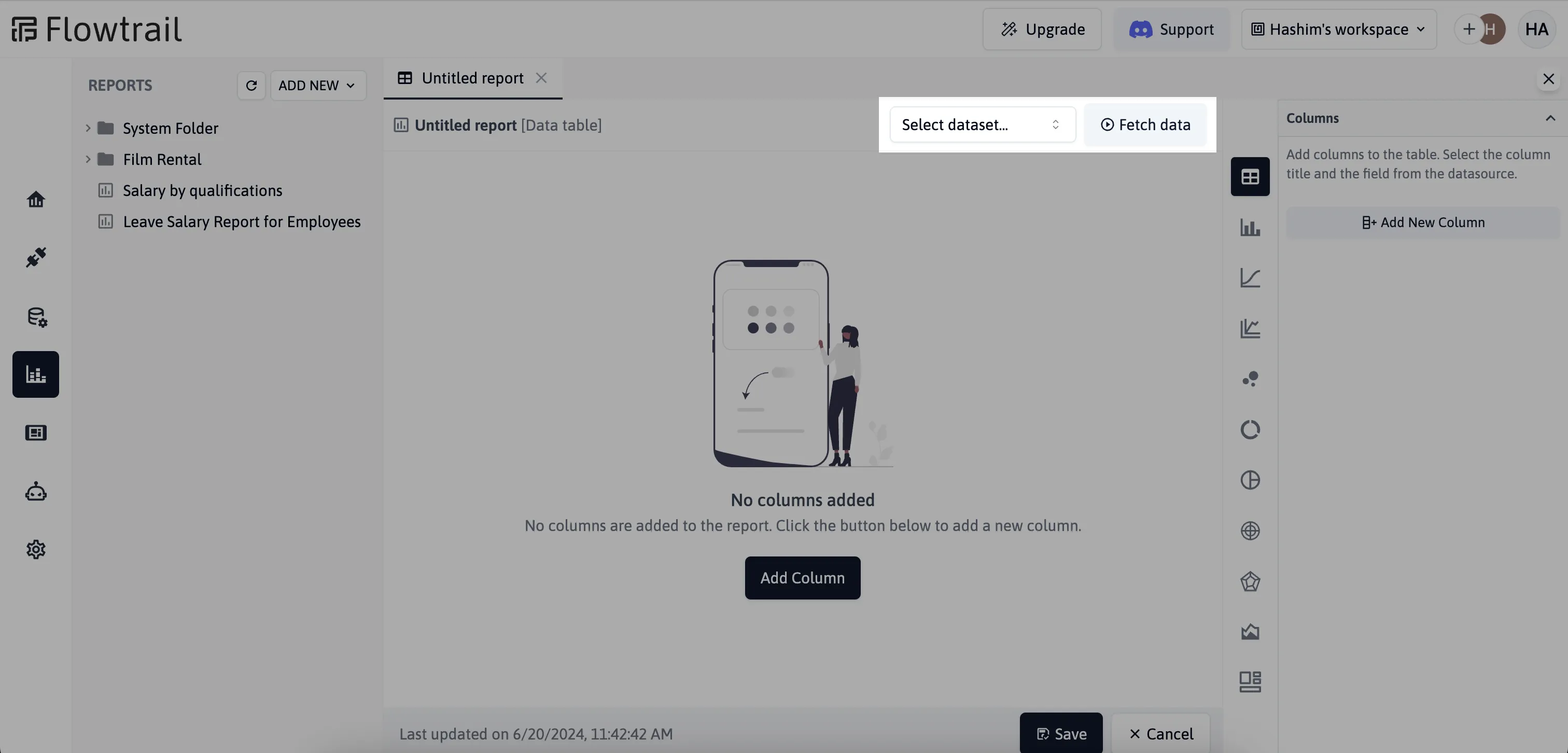
Select Dataset
Choose a saved dataset from the list of available datasets. This dataset will serve as the data source for your report. Click the Fetch button to retrieve the data and prepare it for visualization.
Choose Chart Type
Flowtrail AI supports various types of charts, tables, and custom templates for visualizing your data. This section focuses on creating and customizing charts.
After fetching the data, select the type of chart you want to create. Available chart types include bar charts, line charts, pie charts, and more.
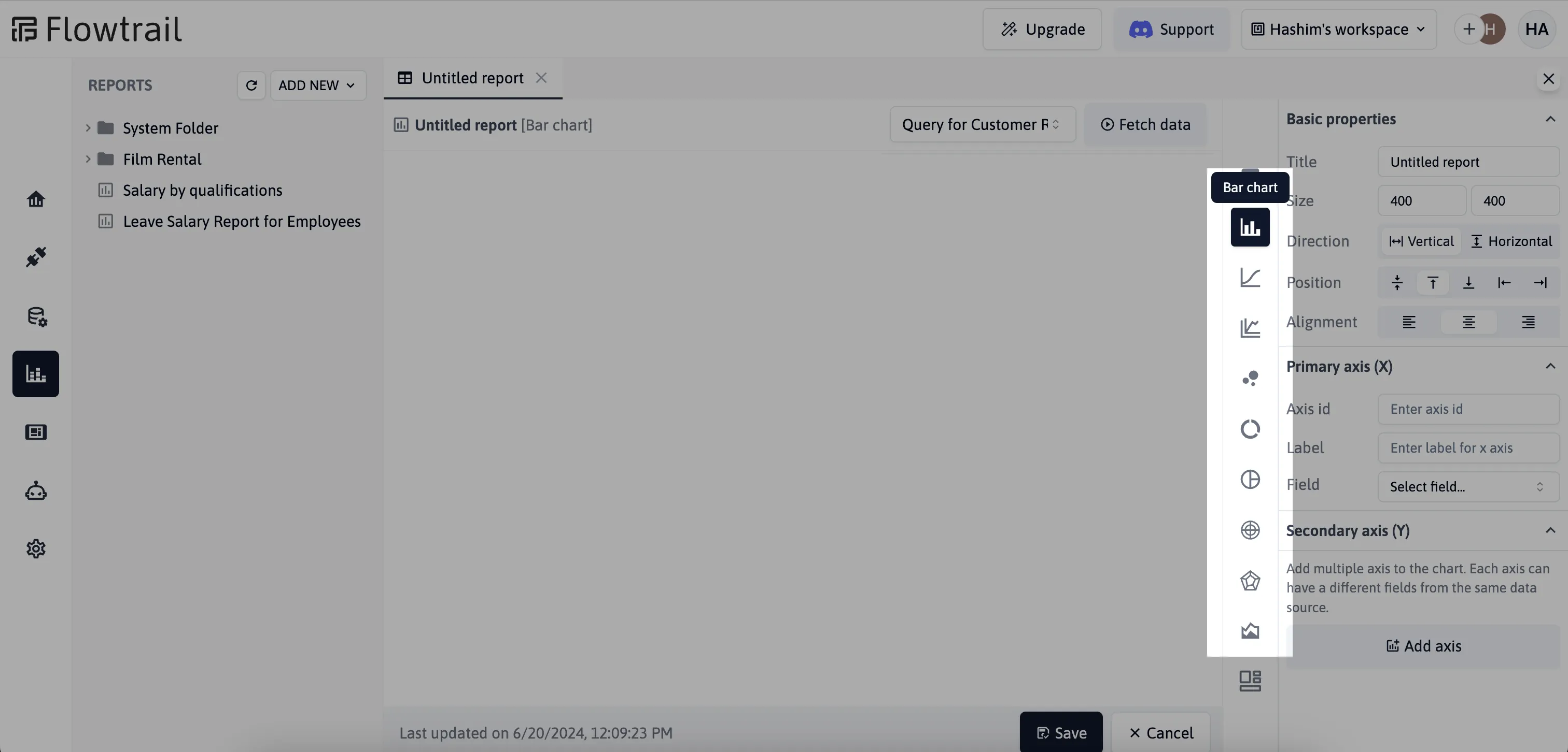
Chart Properties
To make your reports more customizable, you can configure chart properties
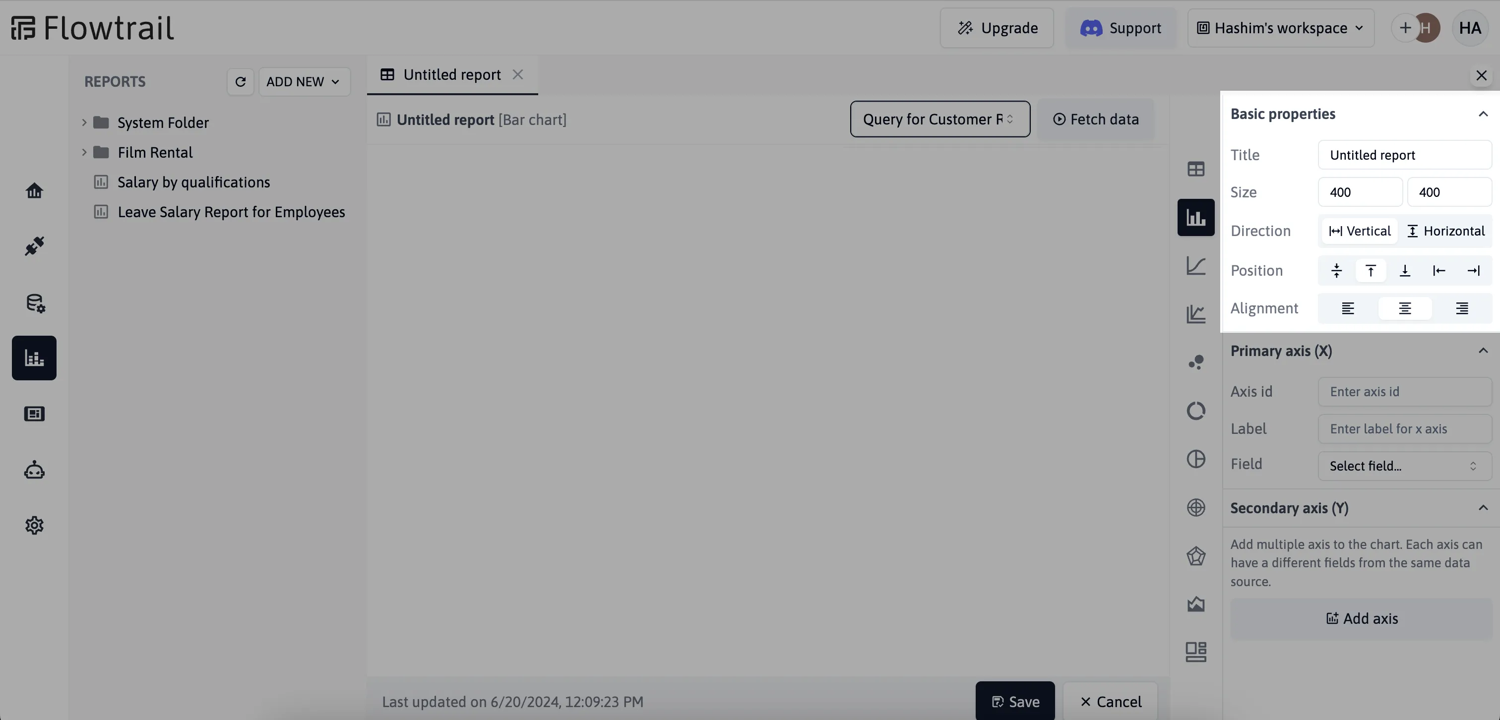
- Width and Height: Set the dimensions of the chart to fit your display needs.
- Direction of the Chart: Specify the orientation of the chart (e.g., horizontal or vertical).
- Position of the Legend: Choose where the legend will be placed on the chart (e.g., top, bottom, left, right).
- Alignment of the Legend: Align the legend as needed within its position (e.g., start, center, end).
X Axis Configuration
Configure the primary X axis by setting its unique ID, label, and the field from your dataset to display. This setup defines how the data will be represented along the horizontal axis of your chart, providing context and clarity for your visualizations.
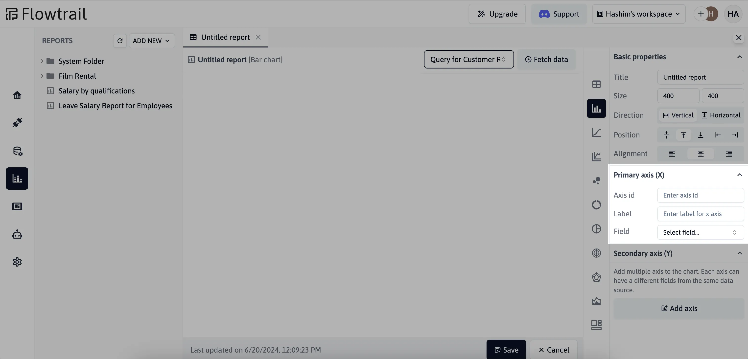
- ID: Unique identifier for the X axis.
- Label: Descriptive label for the X axis.
- Field to Display: The field from your dataset that will be represented on the X axis.
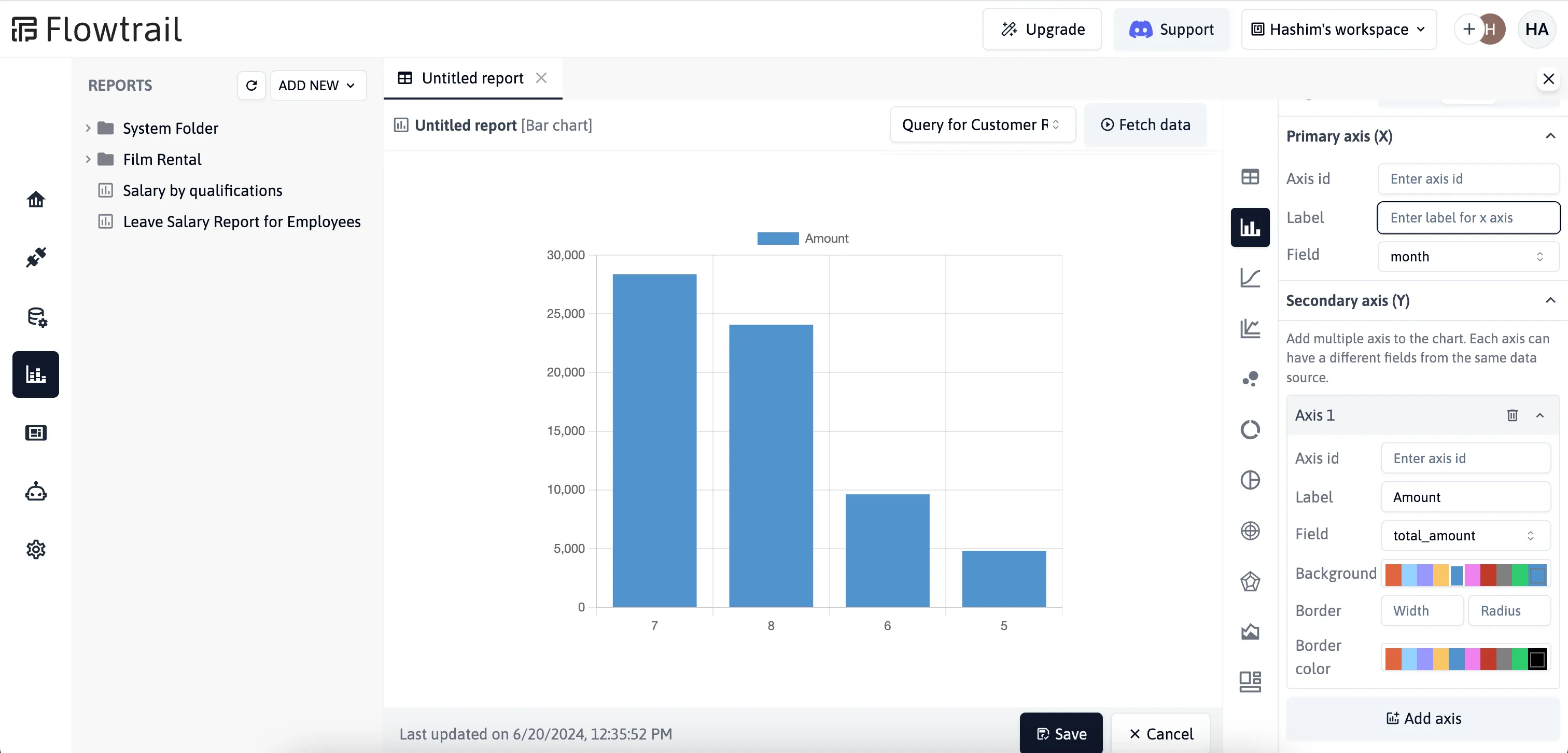
Y Axis Configuration
Users can add multiple Y axes to the chart. Each Y axis has the following properties:
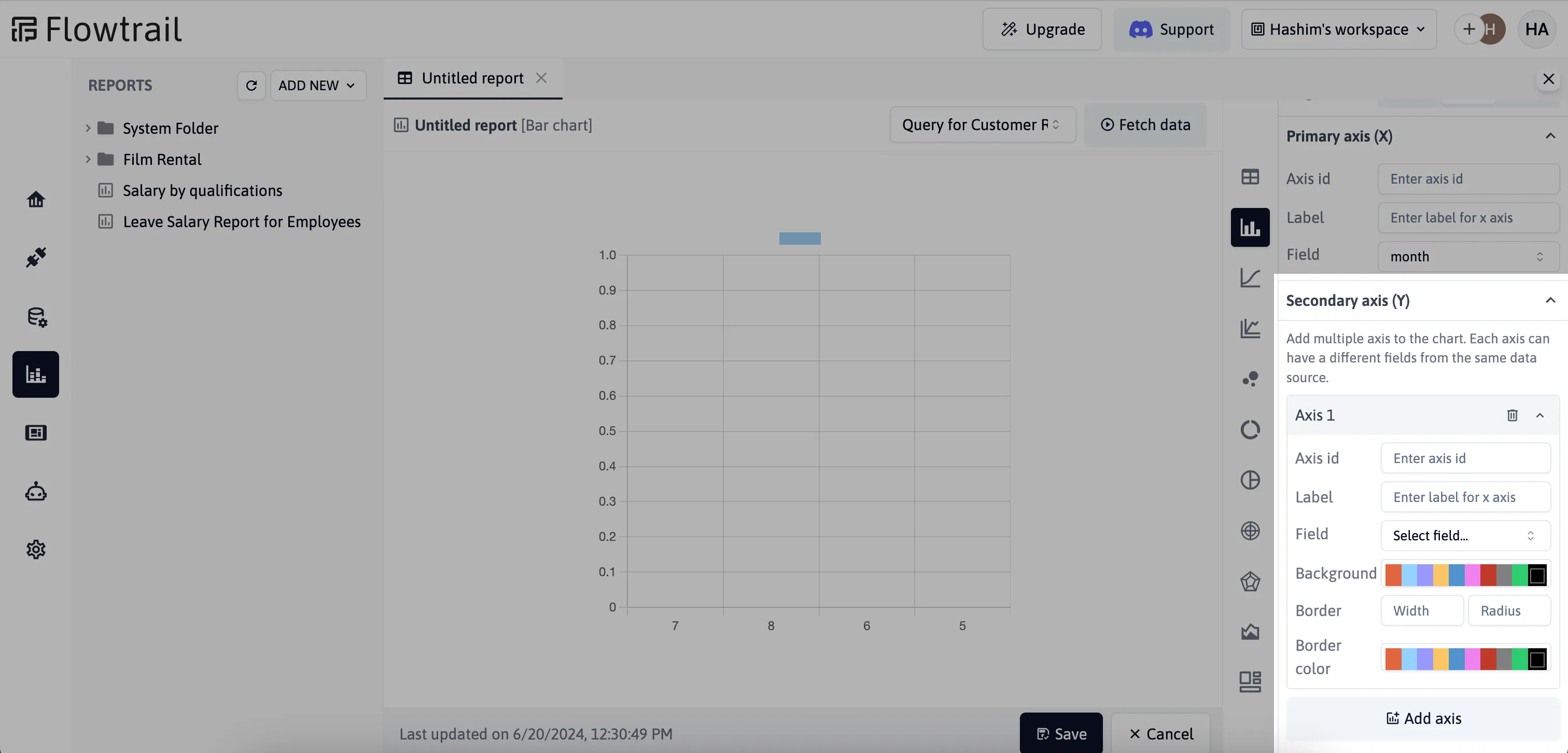
- ID: Unique identifier for the Y axis.
- Label: Descriptive label for the Y axis.
- Field: The field from your dataset that will be represented on the Y axis.
- Background Color: Select the background color using a color picker.
- Border Width: Set the width of the border around the chart elements.
- Border Radius: Define the radius for the borders to round the corners.
- Border Color: Choose the color for the border.
Sample report
Below is a screenshot of a sample report generated using Flowtrail AI. This report demonstrates the customizability and visualization options available:
 Your can change the chart types by selecting different options from the right panel, allowing for quick adjustments and previews.
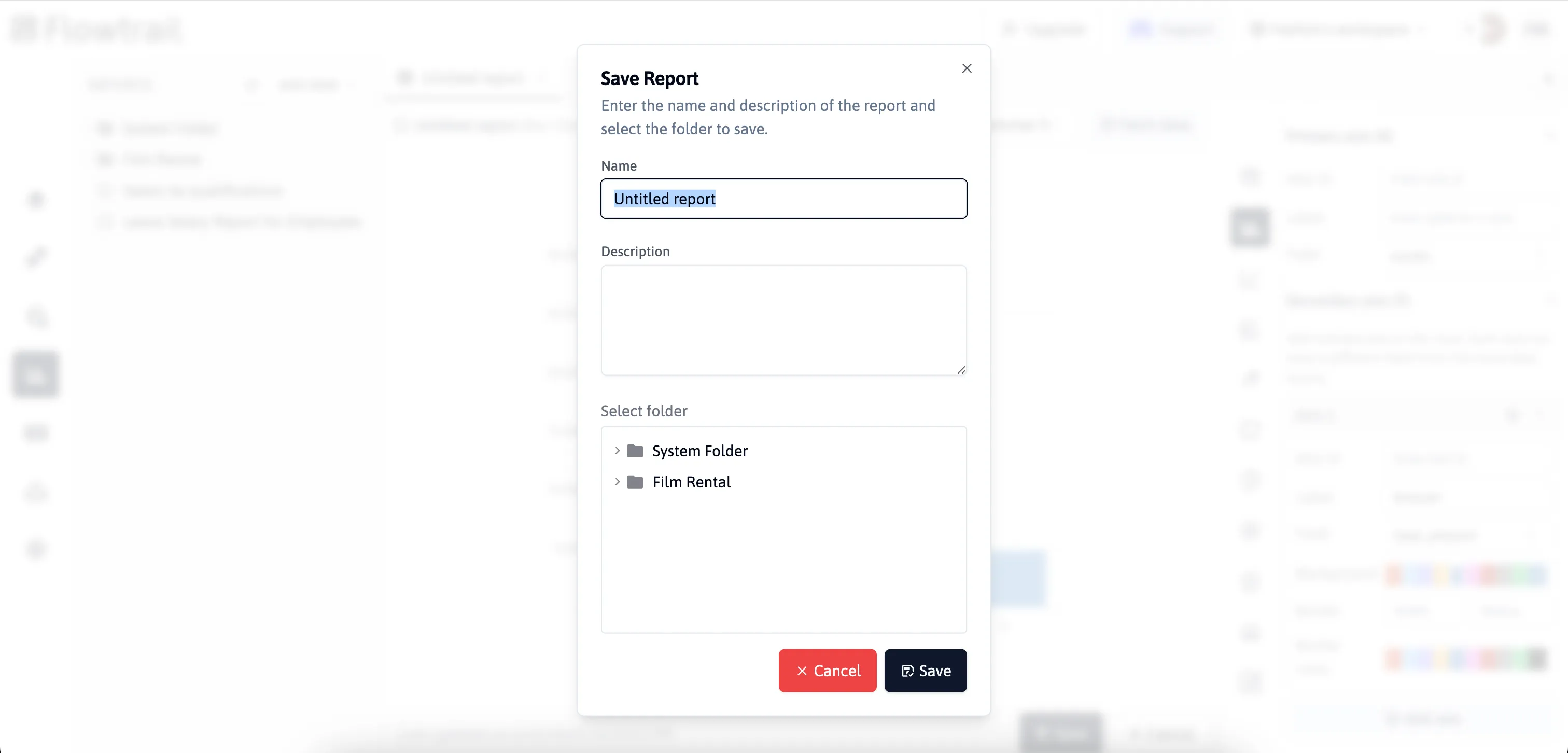
Saving Reports
After configuring your chart properties, save your report for future use. Organize your reports by saving them in specific folders, making them easy to access and manage. This helps keep your reports structured and ensures efficient retrieval when needed
Troubleshooting and Additional Help
If you encounter any issues or have questions about creating reports email us for support.